With the progressive changes on Zollverein the tasks and objectives of the foundation have grown. By working with many different service providers, both the equipment as well as the media for advertising have developed in a very different and "colorful" way.
For a uniform appearance, which is fair for a world heritage site, it was important to keep both the equipment as well as media for external communications (event posters, programs, etc.) together in a unified design concept. The aim was to present the Foundation "Ruhr Museum" and the orientation system on the premises in a homogeneous appearance.
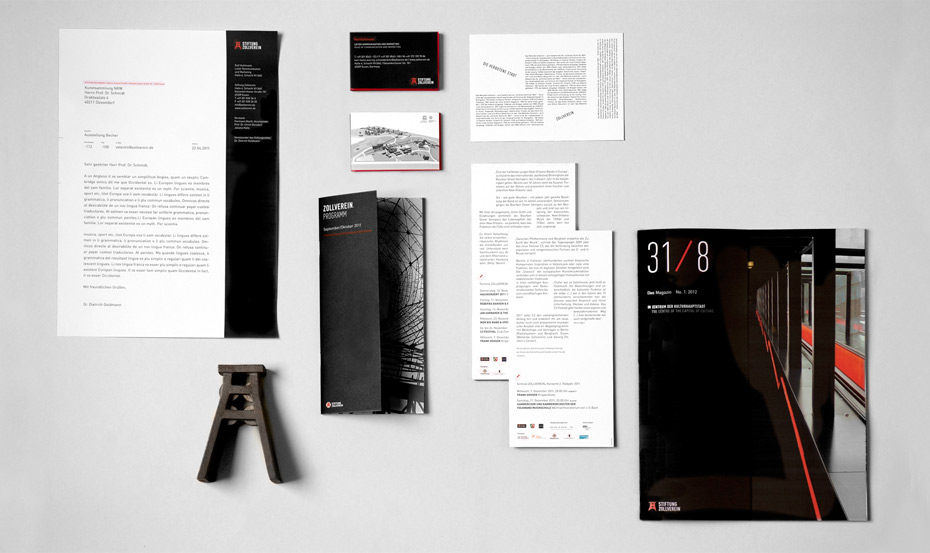
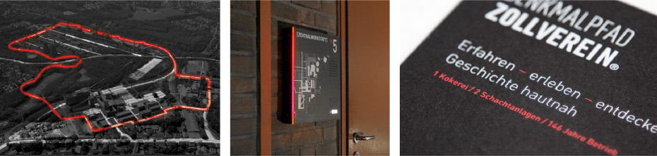
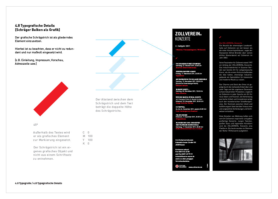
Elements of the orientation system find their way into the office equipment. The often underestimated size of the site is described the plan of the site on the back of business cards and letterhead and gives the opportunity to situate their own work. Due to the withdrawal of color and the strong use of black, the topic coal is staged. The complex manual is a useful guide for working with various external service providers.
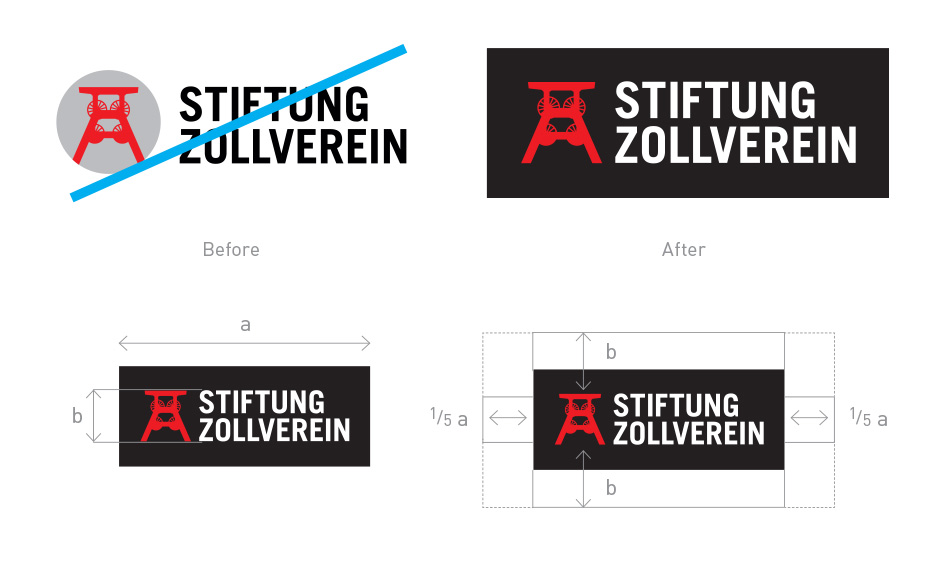
Stiftung Zollverein Corporate design (redesign) | Logo
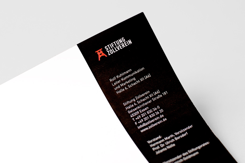
Stiftung Zollverein Corporate design (redesign) | Letterhead
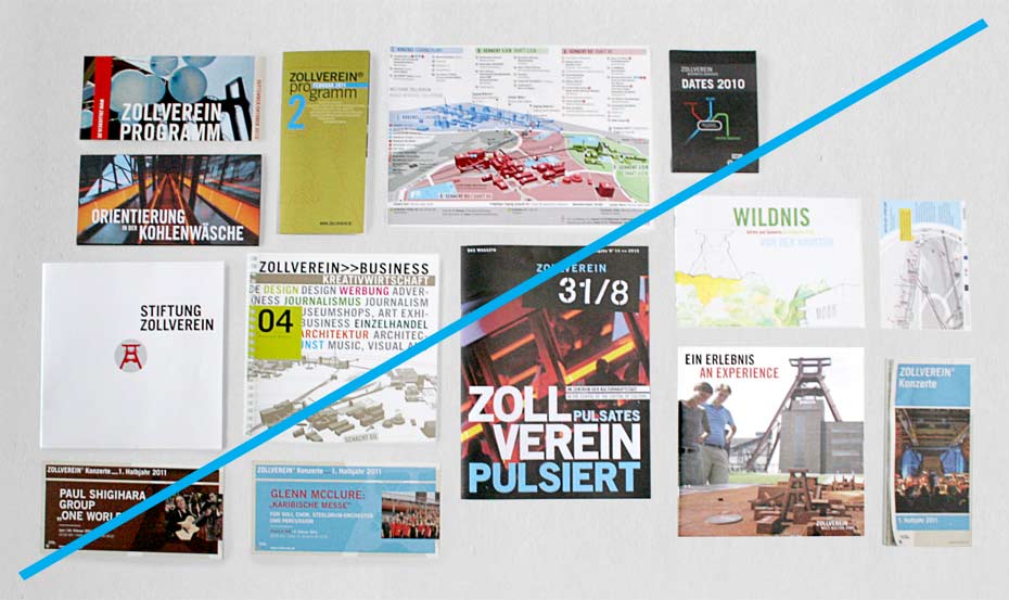
Stiftung Zollverein Corporate design (redesign) | Media before - after
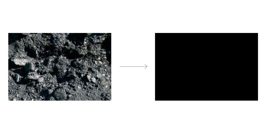
Stiftung Zollverein Corporate design (redesign) | Color
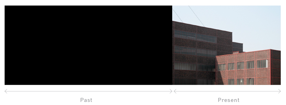
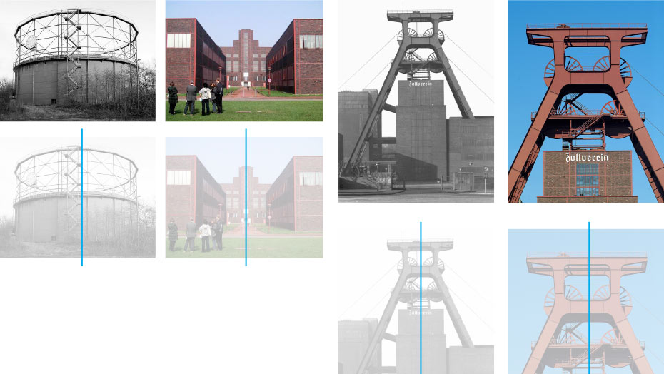
Stiftung Zollverein Corporate design (redesign) | Historical reference
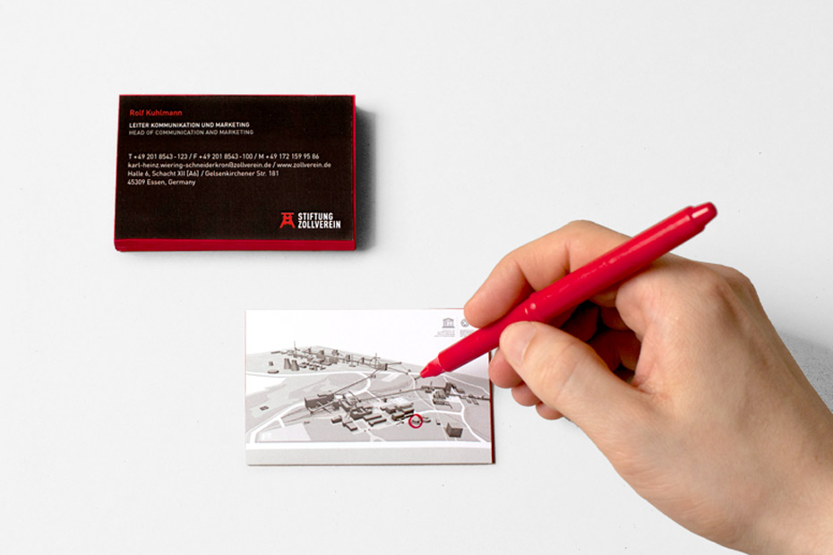
Stiftung Zollverein Corporate design (redesign) | Business card
Stiftung Zollverein Corporate design (redesign) | Historical reference
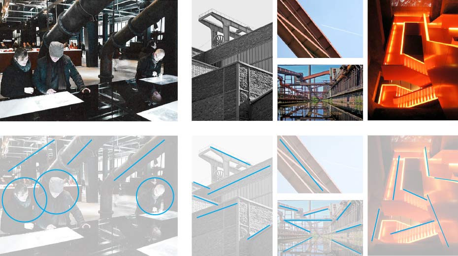
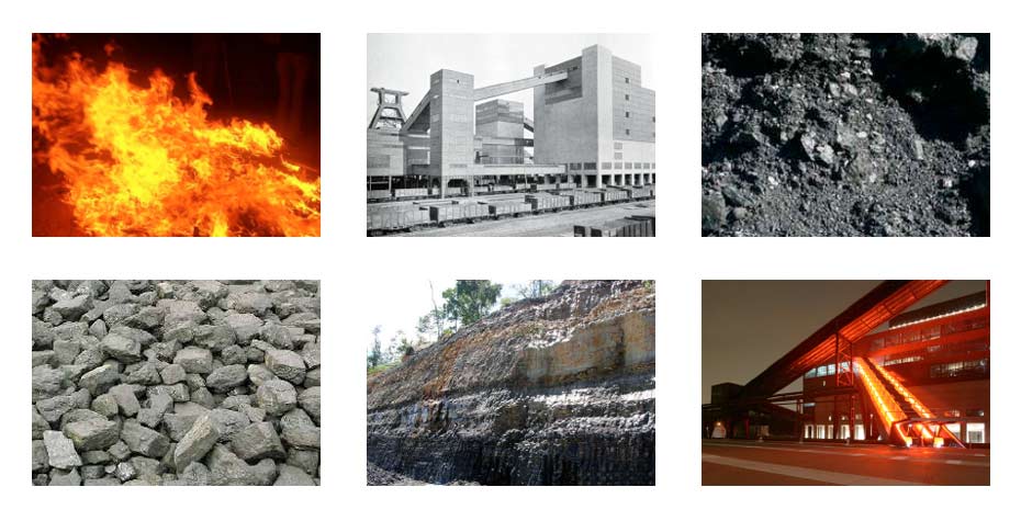
Stiftung Zollverein Corporate design (redesign) | Imagery
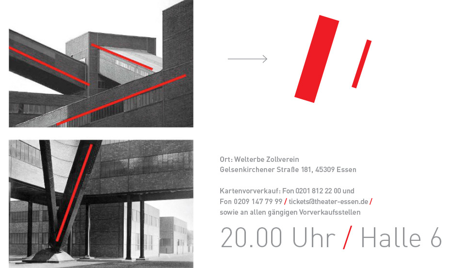
Stiftung Zollverein Corporate design (redesign) | The red tape (application in corporate design)
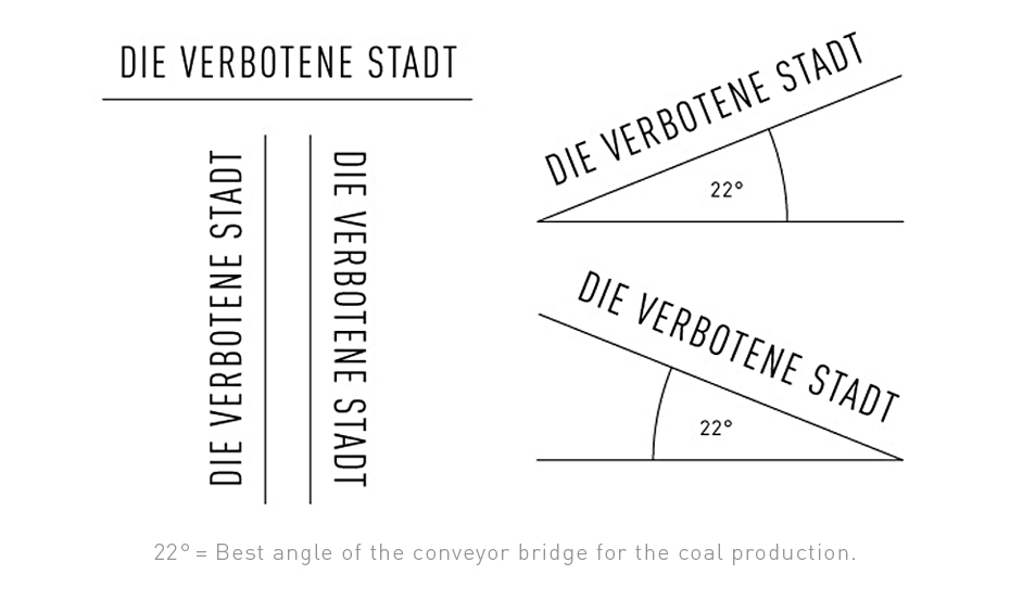
Stiftung Zollverein Corporate design (redesign) | Architectural typography
Stiftung Zollverein Corporate design (redesign) | Architectural typography
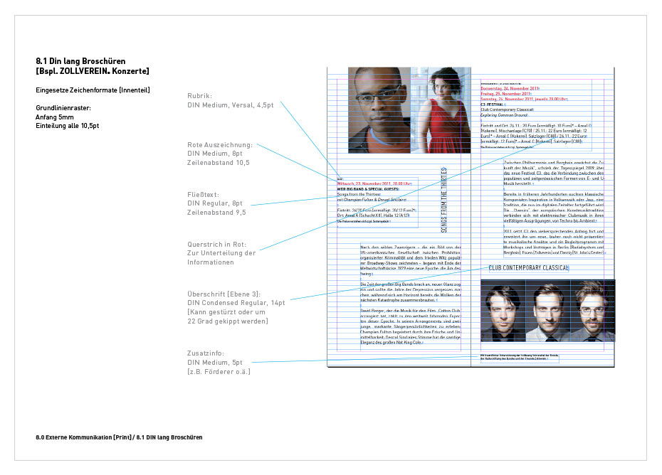
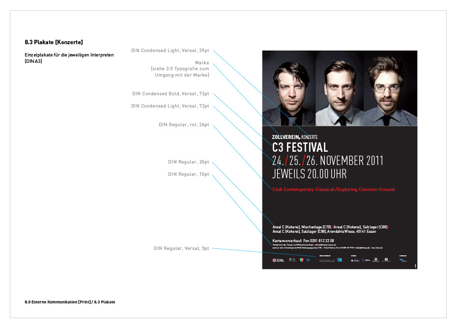
Stiftung Zollverein Corporate design (redesign) | Manual
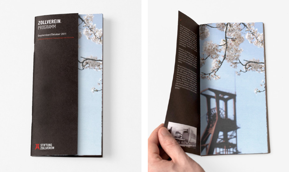
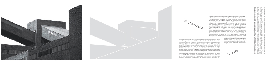
Stiftung Zollverein Corporate design (redesign) | Brochure
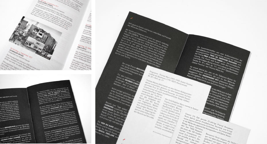
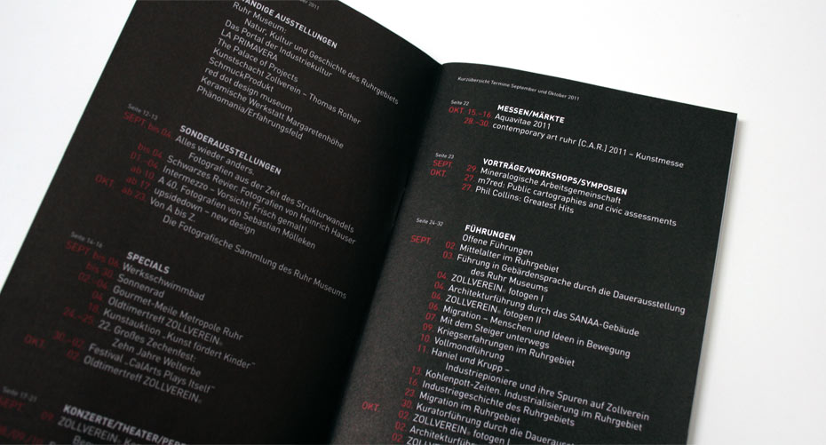
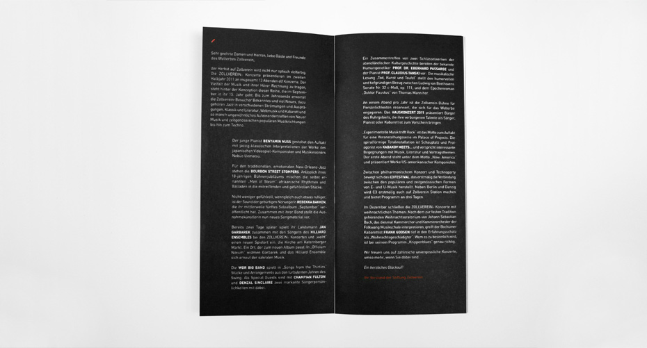
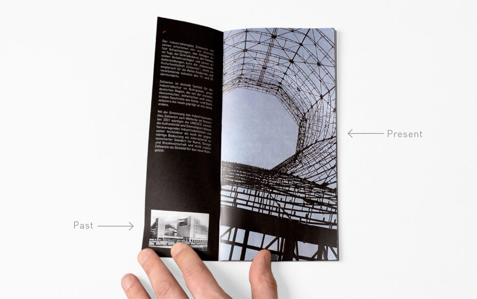
Stiftung Zollverein Corporate design (redesign) | Brochure
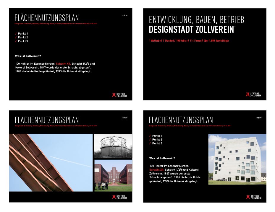
Stiftung Zollverein Corporate design (redesign) | Powerpoint
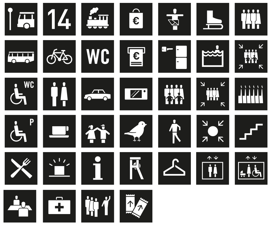
Stiftung Zollverein Corporate design (redesign) | Pictogramms